Chart position — tracked daily by LaunchShots
Screenshot style breakdown
Sampled from 5 of TruyenC - Đọc Truyện Chữ Full's App Store screenshots — background, accent and theme, measured by LaunchShots (not something Apple publishes).
#0CB4D4 bg
#0A9EBA
#8464F4 accent
#111111 text
Reading the caption text from the screenshots in your browser…
Screenshots
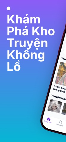
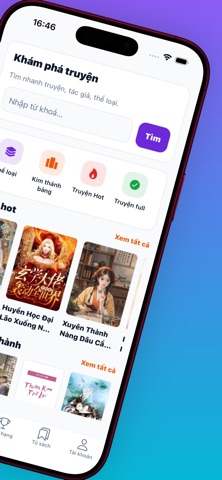


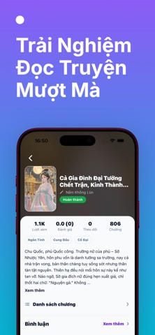
iPad screenshots


Icon palette
About this app
TruyenC - Nơi hàng triệu người đọc truyện chữ đắm chìm! - Tải ngay TruyenC để sở hữu kho truyện khổng lồ hơn 15.000+ tác phẩm hoàn toàn miễn phí. Ứng dụng truyện online và offline hàng đầu dành cho tín đồ ngôn tình, xuyên không, đam mỹ, tiên hiệp và nhiều thể loại hấp dẫn khác. * TẠI SAO BẠN NÊN DÙNG TRUYENC? - Thư Viện Truyện Khổng Lồ và Cập Nhật Liên Tục: Dành trọn cho bạn hàng loạt thể loại hot như Ngôn tình, Ngược, Sủng, Hài hước, Xuyên không, Dị giới, Tiên hiệp, Đam mỹ, Đô thị, Teen, Thập niên, Tình cảm gia đình. - Trải Nghiệm Đọc Cá Nhân Hóa: Tùy chỉnh chế độ đọc cuộn dọc, lướt ngang, Fullscreen. Điều chỉnh font chữ, kích thước chữ, màu nền sáng tối theo ý thích. Tự động lưu vị trí chương đọc cuối cùng. - Tích Hợp Trải Nghiệm Mượt Mà: Đăng nhập cực nhanh qua mạng xã hội như Apple, Google. Hệ thống quảng cáo AdMob được tối ưu hóa thông minh, giảm thiểu gián đoạn tối đa khi bạn…
App details
What you can learn from TruyenC - Đọc Truyện Chữ Full
Every shipping app on the App Store has gone through the same decisions you're working through right now: which screenshot goes first, what caption sits over it, which device frame to show, what color the background should be. The 10 screenshots above are TruyenC - Đọc Truyện Chữ Full's answers to those questions — they're public, they're real, and they made it through Apple's review.
What the numbers say: TruyenC - Đọc Truyện Chữ Full runs a light set where the background shifts from screenshot to screenshot (first shot #0CB4D4) — each image has to stand on its own, so the captions carry more of the story. The accent colour we picked up, #8464F4, is the one to reuse for badges, arrows and highlighted words if you borrow this look. Hit Use this style to open the editor with these exact colours and drop your own screenshot in.
Notice the first screenshot in particular. It's the one users see in search results and on the product page, and it's where most apps spend their best caption and tightest design. Look at the proportion of background to phone, where the text sits, what one thing the image is trying to communicate.
Want to see how other Book apps approach the same problem? Browse more Book apps in the showcase.
Take what works into your own screenshots
Open LaunchShots and design your App Store & Google Play screenshots — pick a device frame, drop captions, ship in minutes. Free, in your browser.
Open the screenshot editor →Apps with a similar look
Closest background + accent colours among the listings we've analysed — useful when you want to see the same palette handled by a different team.