Chart position — tracked daily by LaunchShots
Screenshot style breakdown
Sampled from 6 of Военное дело's App Store screenshots — background, accent and theme, measured by LaunchShots (not something Apple publishes).
#444444 bg
#5E5E5E
#7C54FC accent
#FFFFFF text
Screenshots
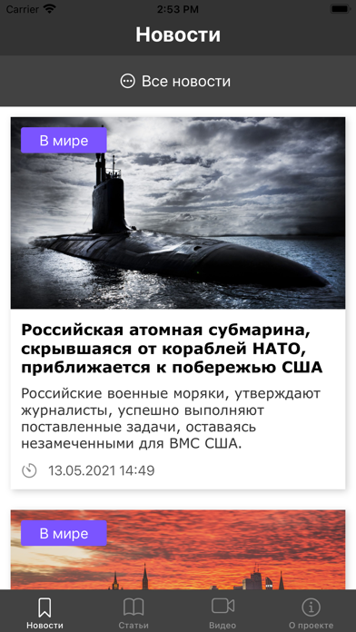
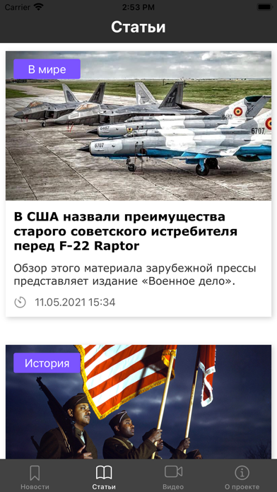
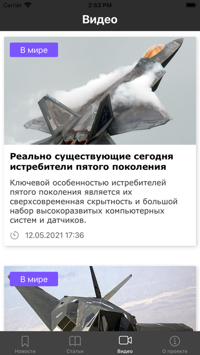
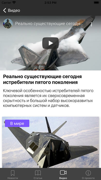
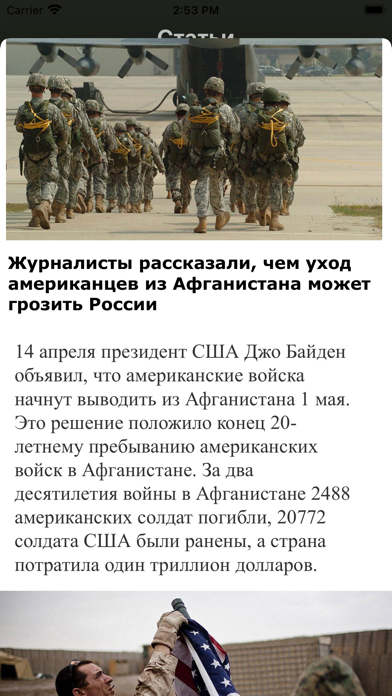
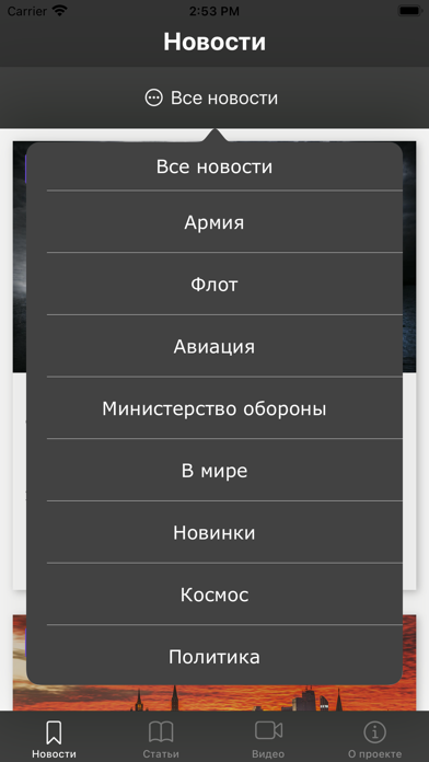
iPad screenshots


Icon palette
About this app
VD Ios Военное дело — это новостное приложение, посвященное военной и политической сфере. Здесь вы найдете объективные, актуальные и точные новости со всего мира, обеспечивающие вас полной информацией о последних событиях в области обороны, международной политики и безопасности. Мы предлагаем: 1. Актуальные новости. Наши редакторы следят за событиями 24/7, чтобы вы не пропустили ни одного важного события. Будьте в курсе важнейшей военной и политической повестки. 2. Аналитические обзоры. Глубокие исследования и аналитические статьи от наших экспертов помогут вам лучше понять контекст и последствия ключевых событий. 4. Уведомления о самом важном. Получайте уведомления только о тех событиях, которые действительно могут вас заинтересовать. 5. Надежность и прозрачность. Наша миссия - предоставлять информацию без предвзятости и фейковых новостей. Мы стремимся быть вашим надежным источн…
App details
What you can learn from Военное дело
Every shipping app on the App Store has gone through the same decisions you're working through right now: which screenshot goes first, what caption sits over it, which device frame to show, what color the background should be. The 11 screenshots above are Военное дело's answers to those questions — they're public, they're real, and they made it through Apple's review.
What the numbers say: Военное дело runs a mixed light-and-dark set where the background shifts from screenshot to screenshot (first shot #444444) — each image has to stand on its own, so the captions carry more of the story. The accent colour we picked up, #7C54FC, is the one to reuse for badges, arrows and highlighted words if you borrow this look. Hit Use this style to open the editor with these exact colours and drop your own screenshot in.
Notice the first screenshot in particular. It's the one users see in search results and on the product page, and it's where most apps spend their best caption and tightest design. Look at the proportion of background to phone, where the text sits, what one thing the image is trying to communicate.
Want to see how other News apps approach the same problem? Browse more News apps in the showcase.
Take what works into your own screenshots
Open LaunchShots and design your App Store & Google Play screenshots — pick a device frame, drop captions, ship in minutes. Free, in your browser.
Open the screenshot editor →Apps with a similar look
Closest background + accent colours among the listings we've analysed — useful when you want to see the same palette handled by a different team.