Chart position — tracked daily by LaunchShots
Screenshot changes — detected by LaunchShots
Screenshot style breakdown
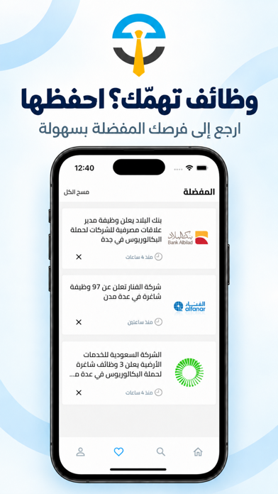
Sampled from 5 of وظائف اليوم's App Store screenshots — background, accent and theme, measured by LaunchShots (not something Apple publishes).
#F4FCFC bg
#D6DDDD
#041C4C accent
#111111 text
Reading the caption text from the screenshots in your browser…
Screenshots



Icon palette
About this app
تابع أحدث الوظائف الشاغرة في المملكة العربية السعودية مع تطبيق وظائف اليوم، واحصل على تحديثات مستمرة وإشعارات عند طرح فرص وظيفية جديدة. يساعدك تطبيق وظائف اليوم على متابعة الإعلانات الوظيفية بسهولة من مكان واحد، دون الحاجة إلى البحث يوميًا في العديد من المواقع والمصادر المختلفة. يمكنك تصفح الوظائف وبرامج التدريب والاطلاع على تفاصيل الفرص المتاحة وطريقة التقديم عليها، مع إمكانية حفظ الفرص التي تهمك والعودة إليها لاحقًا. أقسام التطبيق: * الوظائف المدنية * الوظائف العسكرية * وظائف الشركات * التدريب التعاوني * برامج الخريجين * نتائج القبول مميزات تطبيق وظائف اليوم: * تحديثات مستمرة بأحدث الوظائف والفرص المتاحة. * إشعارات فورية عند إضافة فرص جديدة. * وظائف للرجال والنساء. * فرص تدريب تعاوني للطلاب والطالبات. * برامج للخريجين وحديثي التخرج. * واجهة بسيطة وسهلة الاستخدام. * إمكانية حفظ الوظائف في المفضلة. * مشاركة الوظائف بسهولة عبر تطبيقات التواصل الاجتماعي. * الوصول إلى تفاصيل الوظيفة وط…
App details
What you can learn from وظائف اليوم
Every shipping app on the App Store has gone through the same decisions you're working through right now: which screenshot goes first, what caption sits over it, which device frame to show, what color the background should be. The 5 screenshots above are وظائف اليوم's answers to those questions — they're public, they're real, and they made it through Apple's review.
What the numbers say: وظائف اليوم runs a light set with one background colour (#F4FCFC) carried across every screenshot — the listing reads as a single poster when the shots sit side by side in search results. The accent colour we picked up, #041C4C, is the one to reuse for badges, arrows and highlighted words if you borrow this look. Hit Use this style to open the editor with these exact colours and drop your own screenshot in.
Notice the first screenshot in particular. It's the one users see in search results and on the product page, and it's where most apps spend their best caption and tightest design. Look at the proportion of background to phone, where the text sits, what one thing the image is trying to communicate.
Want to see how other News apps approach the same problem? Browse more News apps in the showcase.
Take what works into your own screenshots
Open LaunchShots and design your App Store & Google Play screenshots — pick a device frame, drop captions, ship in minutes. Free, in your browser.
Open the screenshot editor →Apps with a similar look
Closest background + accent colours among the listings we've analysed — useful when you want to see the same palette handled by a different team.