Chart position — tracked daily by LaunchShots
Screenshot style breakdown
Sampled from 6 of Voiser: Аудиокниги и eBook's App Store screenshots — background, accent and theme, measured by LaunchShots (not something Apple publishes).
#040404 bg
#272727
#5C3C24 accent
#FFFFFF text
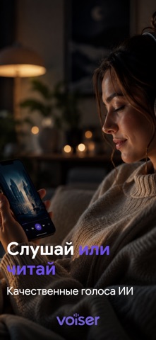
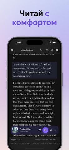
Screenshots




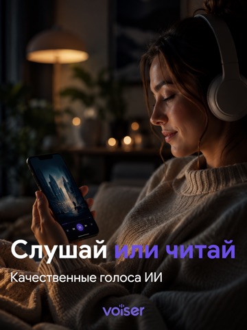
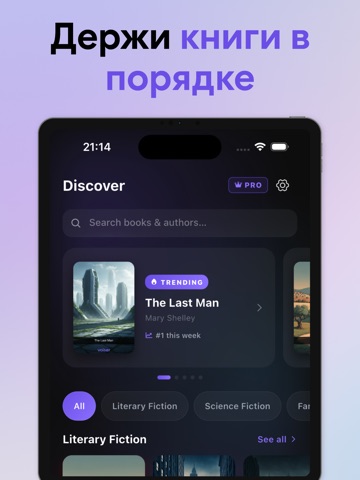
iPad screenshots



Icon palette
About this app
Читай больше. Слушай умнее. На основе ИИ. Voiser объединяет аудиокниги, электронные книги и резюме книг на базе ИИ в одном приложении. Тысячи книг — прямо сейчас К каждой книге прилагается резюме от ИИ — получи ключевые идеи за 3 минуты. ИИ-озвучка с улучшенным качеством звука ИИ-голоса Voiser созданы для долгих сессий прослушивания — чёткие, естественные, в 5 стилях, с значительно улучшенным качеством звука. Твой EPUB становится аудиокнигой за секунды Импортируй любой EPUB-файл и Voiser мгновенно конвертирует его в аудио. Используй встроенный поиск по EPUB, чтобы мгновенно найти любой фрагмент. Автоматический поиск книг Введи название книги и Voiser автоматически найдёт её в интернете. Доступ к тысячам бесплатных книг через Project Gutenberg и Open Library. Читай любой формат Импортируй файлы EPUB, PDF или TXT и читай или слушай их в одном месте. Одна библиотека — везде Создай л…
App details
What you can learn from Voiser: Аудиокниги и eBook
Every shipping app on the App Store has gone through the same decisions you're working through right now: which screenshot goes first, what caption sits over it, which device frame to show, what color the background should be. The 12 screenshots above are Voiser: Аудиокниги и eBook's answers to those questions — they're public, they're real, and they made it through Apple's review.
What the numbers say: Voiser: Аудиокниги и eBook runs a mixed light-and-dark set where the background shifts from screenshot to screenshot (first shot #040404) — each image has to stand on its own, so the captions carry more of the story. The accent colour we picked up, #5C3C24, is the one to reuse for badges, arrows and highlighted words if you borrow this look. Hit Use this style to open the editor with these exact colours and drop your own screenshot in.
Notice the first screenshot in particular. It's the one users see in search results and on the product page, and it's where most apps spend their best caption and tightest design. Look at the proportion of background to phone, where the text sits, what one thing the image is trying to communicate.
Want to see how other Book apps approach the same problem? Browse more Book apps in the showcase.
Take what works into your own screenshots
Open LaunchShots and design your App Store & Google Play screenshots — pick a device frame, drop captions, ship in minutes. Free, in your browser.
Open the screenshot editor →Apps with a similar look
Closest background + accent colours among the listings we've analysed — useful when you want to see the same palette handled by a different team.