Chart position — tracked daily by LaunchShots
Screenshot style breakdown
Sampled from 6 of DNA Performance Lab's App Store screenshots — background, accent and theme, measured by LaunchShots (not something Apple publishes).
#FCFCFC bg
#DDDDDD
#FCDC04 accent
#111111 text
Screenshots
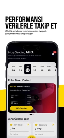
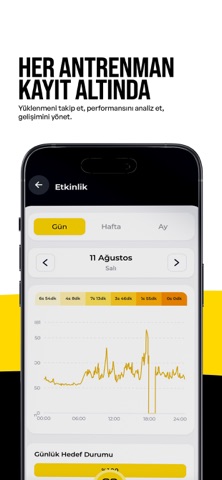
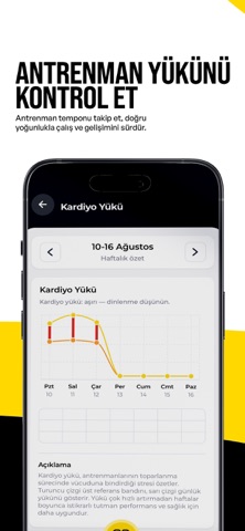

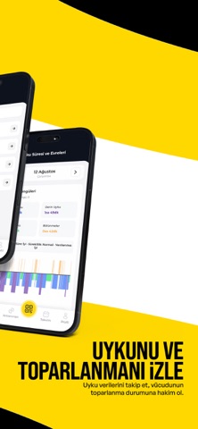
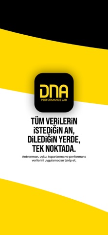
iPad screenshots
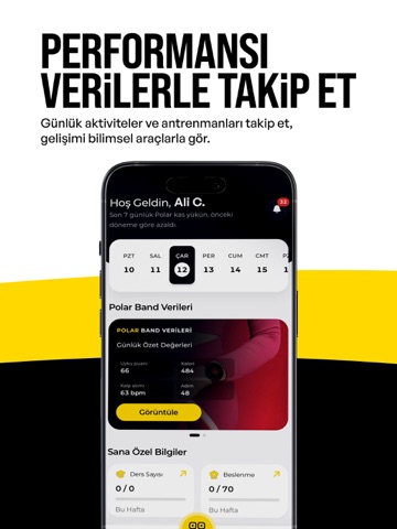
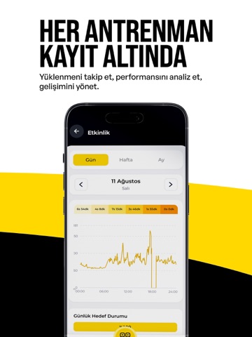


Icon palette
About this app
DNA Performance Lab, sporcuların fiziksel performans gelişimini ölçülebilir veriler ve bireyselleştirilmiş antrenman süreçleriyle yönetmeyi amaçlayan bütüncül bir sporcu performans sistemidir. Sporcunun yalnızca antrenman yaptığı zamanı değil; ölçüm, gelişim, toparlanma ve destek süreçlerini de tek bir yapı içerisinde takip ediyoruz. Performans Ölçüm ve Analiz Bilimsel standartlara uygun test ve ölçüm sistemleriyle sporcuların kuvvet, güç, hız, hareket kapasitesi ve branşa özgü fiziksel performans parametreleri değerlendirilir. Elde edilen veriler, sporcunun gelişim sürecinin objektif olarak takip edilmesine yardımcı olur. Bireyselleştirilmiş Antrenman Her sporcu; yaşı, branşı, pozisyonu, antrenman geçmişi, mevcut fiziksel kapasitesi ve gelişim ihtiyaçları doğrultusunda değerlendirilir. Antrenman süreçleri elde edilen veriler doğrultusunda bireyselleştirilerek planlanır. Performan…
App details
What you can learn from DNA Performance Lab
Every shipping app on the App Store has gone through the same decisions you're working through right now: which screenshot goes first, what caption sits over it, which device frame to show, what color the background should be. The 11 screenshots above are DNA Performance Lab's answers to those questions — they're public, they're real, and they made it through Apple's review.
What the numbers say: DNA Performance Lab runs a light set where the background shifts from screenshot to screenshot (first shot #FCFCFC) — each image has to stand on its own, so the captions carry more of the story. The accent colour we picked up, #FCDC04, is the one to reuse for badges, arrows and highlighted words if you borrow this look. Hit Use this style to open the editor with these exact colours and drop your own screenshot in.
Notice the first screenshot in particular. It's the one users see in search results and on the product page, and it's where most apps spend their best caption and tightest design. Look at the proportion of background to phone, where the text sits, what one thing the image is trying to communicate.
Want to see how other Sports apps approach the same problem? Browse more Sports apps in the showcase.
Take what works into your own screenshots
Open LaunchShots and design your App Store & Google Play screenshots — pick a device frame, drop captions, ship in minutes. Free, in your browser.
Open the screenshot editor →Apps with a similar look
Closest background + accent colours among the listings we've analysed — useful when you want to see the same palette handled by a different team.