Chart position — tracked daily by LaunchShots
Screenshot style breakdown
Sampled from 5 of Антирадар HUD Speed камеры ДПС's App Store screenshots — background, accent and theme, measured by LaunchShots (not something Apple publishes).
#04040C bg
#27272E
#845C54 accent
#FFFFFF text
Screenshots


iPad screenshots



Icon palette
About this app
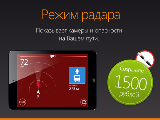
Антирадар HUD Speed – это цифровой спидометр с встроенной функцией предупреждения водителя о превышении ограничения скорости, о камерах ГИБДД и других опасностях на дороге. Наша база камер и опасностей, вероятно, самая точная. Самое главное – базой пользуется более 5.000.000 пользователей, что обеспечивает оперативное обновление данных по камерам ГИБДД и другим опасностям на дорогах. Мы работаем над ней вместе с пользователями уже больше 10 лет! HeadUp Display (HUD) – возможность использовать ваш телефон или планшет как проекционный дисплей. Просто положите устройство под лобовое стекло и вы увидите проекцию скорости и предупреждений об опасностях прямо на стекле. Не нужно отвлекаться от дороги - все непосредственно перед вашими глазами! Ключевые функции: • Радар-детектор HUD Speed предупреждает о стационарных камерах, мобильных засадах и других опасностях на Вашем пути, т.е. выполн…
App details
What you can learn from Антирадар HUD Speed камеры ДПС
Every shipping app on the App Store has gone through the same decisions you're working through right now: which screenshot goes first, what caption sits over it, which device frame to show, what color the background should be. The 9 screenshots above are Антирадар HUD Speed камеры ДПС's answers to those questions — they're public, they're real, and they made it through Apple's review.
What the numbers say: Антирадар HUD Speed камеры ДПС runs a dark set with one background colour (#04040C) carried across every screenshot — the listing reads as a single poster when the shots sit side by side in search results. The accent colour we picked up, #845C54, is the one to reuse for badges, arrows and highlighted words if you borrow this look. Hit Use this style to open the editor with these exact colours and drop your own screenshot in.
Notice the first screenshot in particular. It's the one users see in search results and on the product page, and it's where most apps spend their best caption and tightest design. Look at the proportion of background to phone, where the text sits, what one thing the image is trying to communicate.
Want to see how other Navigation apps approach the same problem? Browse more Navigation apps in the showcase.
Take what works into your own screenshots
Open LaunchShots and design your App Store & Google Play screenshots — pick a device frame, drop captions, ship in minutes. Free, in your browser.
Open the screenshot editor →Apps with a similar look
Closest background + accent colours among the listings we've analysed — useful when you want to see the same palette handled by a different team.