Chart position — tracked daily by LaunchShots
Screenshot style breakdown
Sampled from 5 of World Monitor - Intelligence's App Store screenshots — background, accent and theme, measured by LaunchShots (not something Apple publishes).
#0C141C bg
#2E343B
#44ACB4 accent
#FFFFFF text
Screenshots


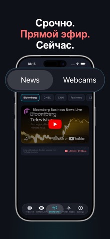
iPad screenshots


Icon palette
About this app
Отслеживайте войны, конфликты и глобальные кризисы в режиме реального времени — на интерактивной карте разведки. World Monitor доставляет геополитическую разведку прямо на ваш экран. Мониторинг активных зон конфликтов, военных перемещений, энергетической инфраструктуры и мировых новостей на постоянно обновляемой карте. — ГЛОБАЛЬНАЯ КАРТА ТЕАТРА — • Активные зоны конфликтов: Украина, Газа, Красное море, Судан, Мьянма и др. • Военные базы и ядерные объекты по всему миру • Нефтяные и газовые трубопроводы — 90+ маршрутов критической инфраструктуры • Подводные интернет-кабели с данными о геополитической уязвимости • Морские проливы и стратегические водные пути • Кибер-угрозы и аналитика APT-групп • Сейсмическая активность и землетрясения в реальном времени — LIVE ЛЕНТА РАЗВЕДКИ — • Экстренные новости с классификацией уровня угрозы (Критический / Высокий / Средний / Низкий) • Фильтр по рег…
App details
What you can learn from World Monitor - Intelligence
Every shipping app on the App Store has gone through the same decisions you're working through right now: which screenshot goes first, what caption sits over it, which device frame to show, what color the background should be. The 8 screenshots above are World Monitor - Intelligence's answers to those questions — they're public, they're real, and they made it through Apple's review.
What the numbers say: World Monitor - Intelligence runs a dark set with one background colour (#0C141C) carried across every screenshot — the listing reads as a single poster when the shots sit side by side in search results. The accent colour we picked up, #44ACB4, is the one to reuse for badges, arrows and highlighted words if you borrow this look. Hit Use this style to open the editor with these exact colours and drop your own screenshot in.
Notice the first screenshot in particular. It's the one users see in search results and on the product page, and it's where most apps spend their best caption and tightest design. Look at the proportion of background to phone, where the text sits, what one thing the image is trying to communicate.
Want to see how other News apps approach the same problem? Browse more News apps in the showcase.
Take what works into your own screenshots
Open LaunchShots and design your App Store & Google Play screenshots — pick a device frame, drop captions, ship in minutes. Free, in your browser.
Open the screenshot editor →Apps with a similar look
Closest background + accent colours among the listings we've analysed — useful when you want to see the same palette handled by a different team.