Chart position — tracked daily by LaunchShots
Screenshot style breakdown
Sampled from 6 of Wearther: Weather & Outfit's App Store screenshots — background, accent and theme, measured by LaunchShots (not something Apple publishes).
#ACBCCC bg
#97A5B3
#5C7CA4 accent
#111111 text
Reading the caption text from the screenshots in your browser…
Screenshots


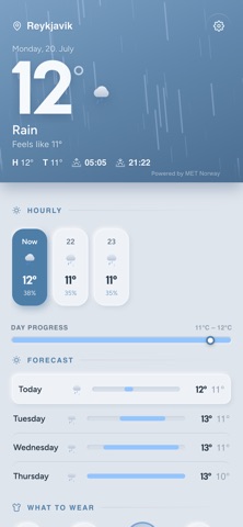


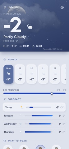

iPad screenshots


Icon palette
About this app
Wearther точно подскажет, что надеть — на основе реальной погоды прямо сейчас в вашем месте. Хватит гадать каждое утро, что надеть. Wearther считывает актуальный прогноз и превращает его в понятную рекомендацию по одежде одним взглядом: верх, низ, обувь, куртка и дополнения вроде шапки или зонта. Один взгляд — и вы одеты правильно. ДЛЯ ВСЕЙ СЕМЬИ Каждый ощущает погоду по-своему. Переключайтесь между «Малыш», «Ребёнок», «Женщина» и «Мужчина», чтобы получить подходящий образ для каждого — так вы будете знать, как одеть малыша сегодня или что надеть детям перед школой, а не только себе. Идеально для родителей, которые хотят, чтобы их дети были комфортно одеты и защищены в любую погоду. ДОЖДЬ, ХОЛОД ИЛИ ЖАРА — ВСЁ РЕШЕНО • Дождь: зонт, непромокаемая куртка и водостойкая обувь • Холод: зимняя куртка, шарф, перчатки и тёплые ботинки • Жара: лёгкая, дышащая одежда и защита от солнца Wearthe…
App details
What you can learn from Wearther: Weather & Outfit
Every shipping app on the App Store has gone through the same decisions you're working through right now: which screenshot goes first, what caption sits over it, which device frame to show, what color the background should be. The 11 screenshots above are Wearther: Weather & Outfit's answers to those questions — they're public, they're real, and they made it through Apple's review.
What the numbers say: Wearther: Weather & Outfit runs a light set where the background shifts from screenshot to screenshot (first shot #ACBCCC) — each image has to stand on its own, so the captions carry more of the story. The accent colour we picked up, #5C7CA4, is the one to reuse for badges, arrows and highlighted words if you borrow this look. Hit Use this style to open the editor with these exact colours and drop your own screenshot in.
Notice the first screenshot in particular. It's the one users see in search results and on the product page, and it's where most apps spend their best caption and tightest design. Look at the proportion of background to phone, where the text sits, what one thing the image is trying to communicate.
Want to see how other Weather apps approach the same problem? Browse more Weather apps in the showcase.
Take what works into your own screenshots
Open LaunchShots and design your App Store & Google Play screenshots — pick a device frame, drop captions, ship in minutes. Free, in your browser.
Open the screenshot editor →Apps with a similar look
Closest background + accent colours among the listings we've analysed — useful when you want to see the same palette handled by a different team.