How to make App Store screenshots that convert
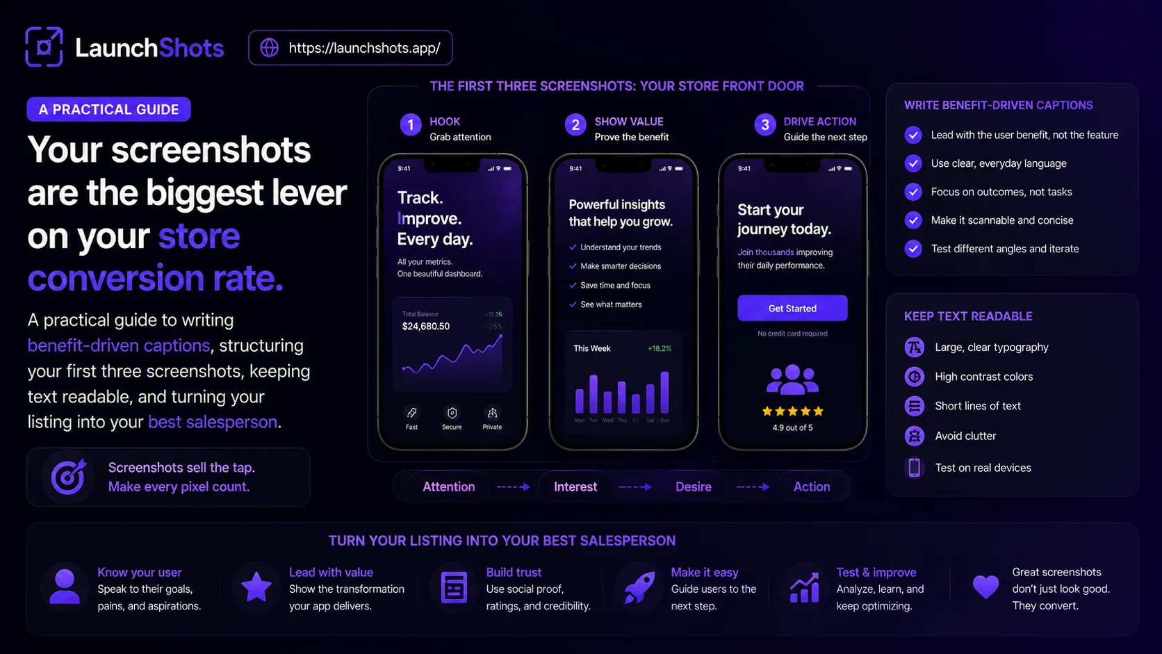
Your app's screenshots are doing more work than almost anything else on your store listing. Before a single person reads your description, they've already formed an opinion from the images — and most of them decide whether to tap "Get" based on what they see in the first few seconds. Yet screenshots are usually the last thing a developer throws together before submitting. This guide is about treating them as what they actually are: your single biggest lever on conversion.
Why screenshots matter more than you think
People skim app listings fast. Studies of store behavior consistently find that users spend only a handful of seconds on a product page before moving on, and that the first two or three screenshots carry most of the weight — most visitors never scroll past them. That means your opening images aren't a gallery; they're an elevator pitch with a few seconds to land.
The brain also processes images far faster than text. A polished screenshot communicates "this app is good and I understand what it does" almost instantly, while a wall of description text does not. This is why the same app can see meaningfully different download rates purely from a screenshot redesign — nothing about the product changed, only how clearly it was communicated.
Lead with the outcome, not the feature
The most common mistake in screenshot captions is describing what the app has instead of what the user gets. "Advanced analytics dashboard" is a feature. "See exactly where your money goes" is an outcome. People install apps because of how the app will make their life better, not because of a feature list.
Look at how strong listings write their captions: short, benefit-driven, emotional. "Start speaking right away." "Become the best version of yourself." "Track every workout automatically." Each one promises a result, in a few words, that the user can feel. Write your captions the same way — lead with the payoff.
Make the first three count
If most people never get past your first three screenshots, those three have to carry your whole story. A useful way to structure them:
- Screenshot 1 — your hook. The single most compelling thing your app does, with your strongest caption. This is the one that stops the scroll.
- Screenshot 2 — the core benefit. The main reason someone would use your app day to day.
- Screenshot 3 — a reason to trust it. A standout feature, social proof, or the moment of delight that seals the decision.
Everything after that is supporting cast. Front-load your best material; don't save it for screenshot six where almost no one will see it.
Design rules that protect readability
Relevance only works if people can actually read your screenshots — and they're viewing them small, in a crowded search result. A few non-negotiables:
- Contrast is everything. Dark text on a light background, or light text on a dark one. Low-contrast captions disappear on a phone screen.
- Big, bold text. Your caption should be legible without tapping to enlarge. If you have to squint on your own phone, it's too small.
- Keep it uncluttered. One idea per screenshot. Too much text or too many UI elements overwhelms the viewer and lowers conversion.
- Stay consistent. A shared color palette, font, and layout across all screenshots makes your listing look intentional and trustworthy.
Show the real app — in a frame
Both stores want your screenshots to reflect the actual app, not abstract marketing art. But "real UI" doesn't mean raw screen captures. Dropping unedited, frameless screen grabs onto your listing is the single biggest tell of a low-effort app — no context, no headline, nothing telling the user why they should care.
The sweet spot is your genuine app UI, placed in a clean device frame, with a short benefit caption above it. That combination shows the product honestly while framing it as something polished and considered.
Don't forget localization
If you're targeting non-English markets, translated screenshots convert noticeably better than English ones shown to non-English speakers. Captions are the highest-impact thing to localize — a user scanning their home store in their own language feels like the app was made for them. Even a few key markets can be worth the effort.
Putting it together
Great screenshots aren't about artistic flair — they're about clarity. Lead with outcomes, make the first three unmissable, keep text big and high-contrast, show the real app in a frame, and localize where it counts. Do that, and your listing does the selling for you.
When you're ready to build a set, our free screenshot editor handles the device frames, captions, backgrounds, and exact store sizes — including localized versions — right in your browser, with no signup or watermark. You bring the screenshots and the captions; it handles the polish.
Related posts

Make your App Store screenshots free
LaunchShots is a free, in-browser screenshot maker. No signup, no watermark.
Open the app →
Comments (0)