App Store Screenshot Themes: Why Category Beats Generic Templates
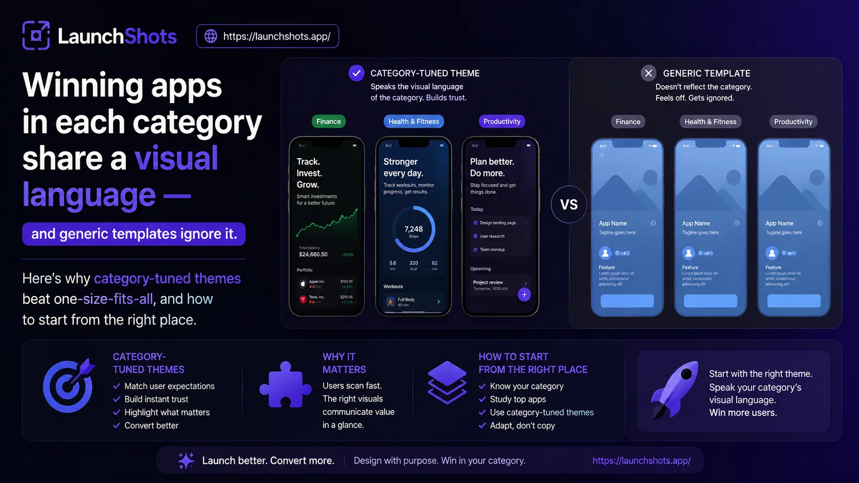
Open the App Store, search any category, and look at the top few apps. You'll notice something fast: the winners in each category tend to look like each other — and unlike the winners in other categories. Finance apps feel calm and trustworthy. Fitness apps feel bold and high-energy. Kids' apps feel playful and bright. That's not an accident, and it's why a single generic screenshot template rarely does your app justice.
Every category has a visual language
Screenshots are the first thing a potential user really sees — bigger than your icon, more than your description. And people scan them in the context of a category. When someone is browsing budgeting apps, their eye has already been trained by the other finance apps they've scrolled past. A neon, high-contrast gaming look would feel off there, no matter how polished it is.
So the question isn't just "do my screenshots look good?" It's "do they look right for where my app lives?" A great fitness screenshot and a great meditation screenshot are both great — but they're great in completely different ways. One leans into intensity; the other into calm.
Why generic templates fall short
Most screenshot tools hand you a pile of templates and let you pick. The problem: those templates are designed to look nice in isolation, not to fit a category. You end up with a screenshot that's technically clean but tonally generic — it could belong to any app, which means it stands out in none.
The fix isn't more templates. It's starting from the right place for your category, then making it yours.
Start from your category, not a blank canvas
That's the idea behind Themes in LaunchShots. Instead of a generic template gallery, themes are grouped by category — fitness, finance, productivity, social, games, travel, food, health, photo, AI, education, music — and each one is tuned to the visual language that tends to work in that space.
Pick a finance theme and you get a clean, light, trustworthy starting point: restrained colors, a confident sans-serif, plenty of breathing room. Pick a gaming theme and you get the opposite energy — deep backgrounds, vivid accents, a bolder typeface. Each theme sets the background, color palette, font, and caption layout for you, so you're not staring at a blank canvas trying to guess what "fits."
They're starting points, not copies
One thing worth being clear about: these are original starting points, designed by category — not scraped screenshots from real apps. The goal isn't to copy what some other app did. It's to give you a head start that already feels at home in your category, so you can skip the awkward first-draft stage and get to the part that matters: making it yours.
Because that's the real point — every theme is just the first move. Once it's applied, the whole editor is yours. Swap the colors to match your brand. Change the font. Rewrite the caption. Adjust the device tilt. The theme gets you 80% of the way to something that fits; you do the last 20% that makes it yours.
How it works
It's about as fast as it sounds:
- Open Themes and filter to your category.
- Browse the styles — each card previews the mood, colors, and caption layout.
- Hit "Apply to editor" and the editor opens with that style already set up.
- Drop in your own screenshot, tweak anything you like, and export.
No signup, no watermark, and like everything in LaunchShots it runs right in your browser — your screenshots never leave your device.
The takeaway
Good App Store screenshots aren't just well-designed — they're well-designed for their category. Starting from a category-tuned theme gives you that fit from the first second, instead of fighting a generic template into shape. Pick the one that matches where your app lives, then make it unmistakably yours.
Browse the themes — they're free, no signup, and apply to the editor in one click.
Related posts
Make your App Store screenshots free
LaunchShots is a free, in-browser screenshot maker. No signup, no watermark.
Open the app →
Comments (0)