Three New Mockup Frames: Clay, Minimal & Browser
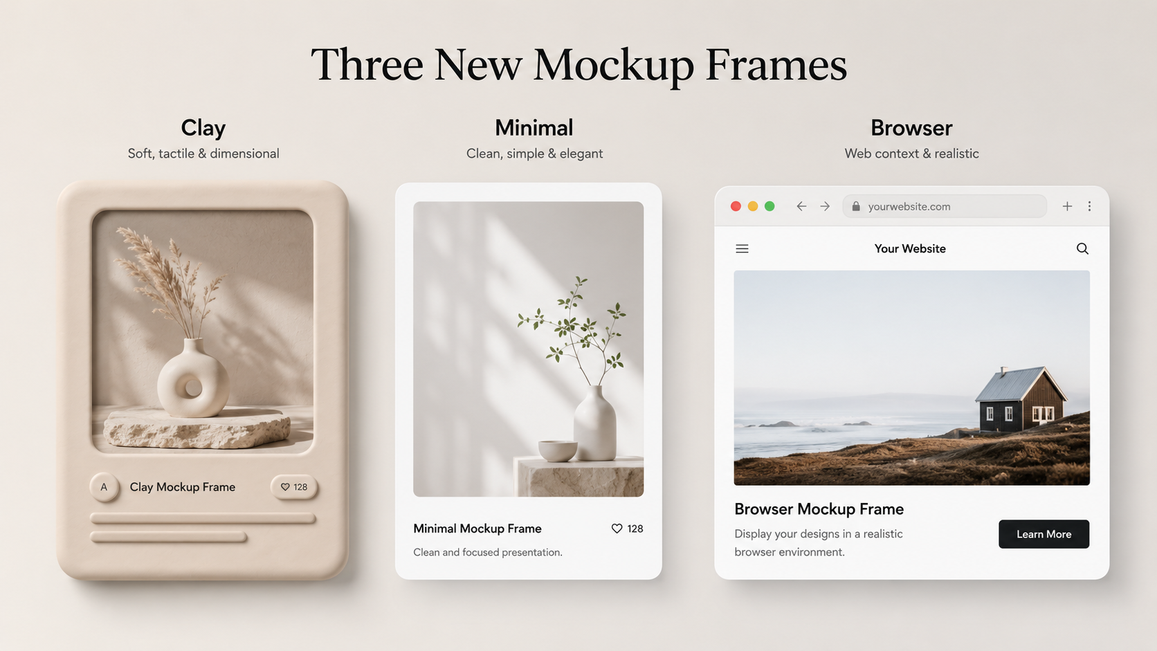
Your app screenshot doesn't always need to sit inside a glossy iPhone. Sometimes a clean, frameless look reads better. Sometimes you're showing a web app, not a phone. So I added three new mockup frames to LaunchShots — and here's when to reach for each one.
You'll find them in the editor under Screenshot → Device, in a new Frames group at the bottom of the list, right below the iPhone and Android options.
Clay — no bezel
Clay drops the phone frame entirely. You get just your screen, with softly rounded corners and a gentle floating shadow. No buttons, no notch, no brand.
It's the cleanest of the three, and it's the one to use when you want the content to be the hero — the screenshot does the talking and nothing competes with it. It works especially well on minimal, single-color backgrounds and in modern marketing layouts where a realistic phone would feel heavy.
Minimal — thin frame
Minimal gives you a slim, neutral dark border around the screen — no notch, no camera, no logo. It hints at "this is on a device" without committing to any specific phone.
Reach for it when you want a little structure and contrast around your screenshot, but you don't want to tie the image to iPhone or Android. It's a safe, understated choice for cross-platform apps, and it keeps the focus on your UI while still framing it nicely.
Browser — web window
The Browser frame wraps your screenshot in a desktop browser window, complete with traffic-light dots and an address bar. It instantly signals "this is a web app."
This one opens LaunchShots up beyond phones. If you've built a web tool, dashboard, or SaaS product, you can now create clean promo images for it too. It pairs best with a wider, landscape screenshot — the kind you'd capture from a desktop browser — but it'll frame anything you upload.
Which one should you use?
A quick rule of thumb: if you're showing a mobile app and want maximum polish, stick with a real iPhone or Android frame. If you want a clean, content-first look, go Clay. If you want light framing without picking a platform, go Minimal. And if it's a web product, go Browser.
All of them export exactly as you see them, at full resolution, in any of the canvas sizes — including the new landscape and social formats.
Give them a try
The new frames are live and free in the editor right now. Open it up, upload a screenshot, and switch between frames to see which fits your app best. If there's a frame you wish existed — a tablet, a foldable, a watch — let me know on the feedback board. More are easy to add when there's demand.
Related posts

Make your App Store screenshots free
LaunchShots is a free, in-browser screenshot maker. No signup, no watermark.
Open the app →
Comments (0)